Clickapporter App

Streamlining a haemorrhaging e-commerce app for clarity and ease of use

Clickapporter

Clickapporter

3 months

3 months

2022

2022

Role: Product Owner & UX Lead

Role: Product Owner & UX Lead

Case Outcomes

By addressing critical usability issues, we transformed a fragmented experience into one that users could navigate confidently, resulting in measurable improvements across key metrics.

-50%

-50%

Support Requests

Support Requests

Fewer "How do I checkout?" queries

Fewer "How do I checkout?" queries

-50%

Support Requests

Fewer "How do I checkout?" queries

+25%

+25%

Conversions

Conversions

More completed purchases and account creations

More completed purchases and account creations

+25%

Conversions

More completed purchases and account creations

-35%

-35%

Uninstall Rate

Uninstall Rate

Post-redesign retention improved significantly

Post-redesign retention improved significantly

-35%

Uninstall Rate

Post-redesign retention improved significantly

Context & Process

Clickapporter is a Moroccan cross-border e-commerce app that helps users shop internationally with localized pricing.

As advertising efforts increased, more users would download the app. However, over time, we noticed severe spikes in uninstalls and customer service requests.

Research

Behavioral Data Analysis

Behavioral Data Analysis

User Feedback Collection

User Feedback Collection

User Journey Testing

User Journey Testing

Customer Interviews

Customer Interviews

Benchmarking

Benchmarking

1

Analysis

Journey Mapping

Journey Mapping

Problem Prioritization

Problem Prioritization

2

Design

Wireframing

Wireframing

Prototyping

Prototyping

Dev Handoff

Dev Handoff

3

The Challenges

Through my extensive research, I was able to pinpoint a number of key insights that guided my approach and design decisions.

Lost Before Landing
Lost Before Landing

Users tapped non-interactive elements (e.g., logos) instead of the intended buttons, causing frustration and early drop-offs.

Users tapped non-interactive elements (e.g., logos) instead of the intended buttons, causing frustration and early drop-offs.

Confusion at Checkout

Unconventional flow, unclear CTAs, and cut-off text left users unsure how to complete purchases.

Unconventional flow, unclear CTAs, and cut-off text left users unsure how to complete purchases.

Delete at First Sight

Abysmal session duration and high uninstall rates post-installation signaled deep usability distrust.

Abysmal session duration and high uninstall rates post-installation signaled deep usability distrust.

No Guide, No Clue
No Guide, No Clue

No onboarding for the app’s unique flow led to confusion about core features like cart management.

No onboarding for the app’s unique flow led to confusion about core features like cart management.

Clickapporter Brand Redesign

This redesign came at the same time as the Clickapporter brand was evolving.

I led the effort of redesigning both the company logo and color pallets used across all mediums.

Redesigned logo

Montserrat Aa

Montserrat Aa

Redesigned logo & Primary Font

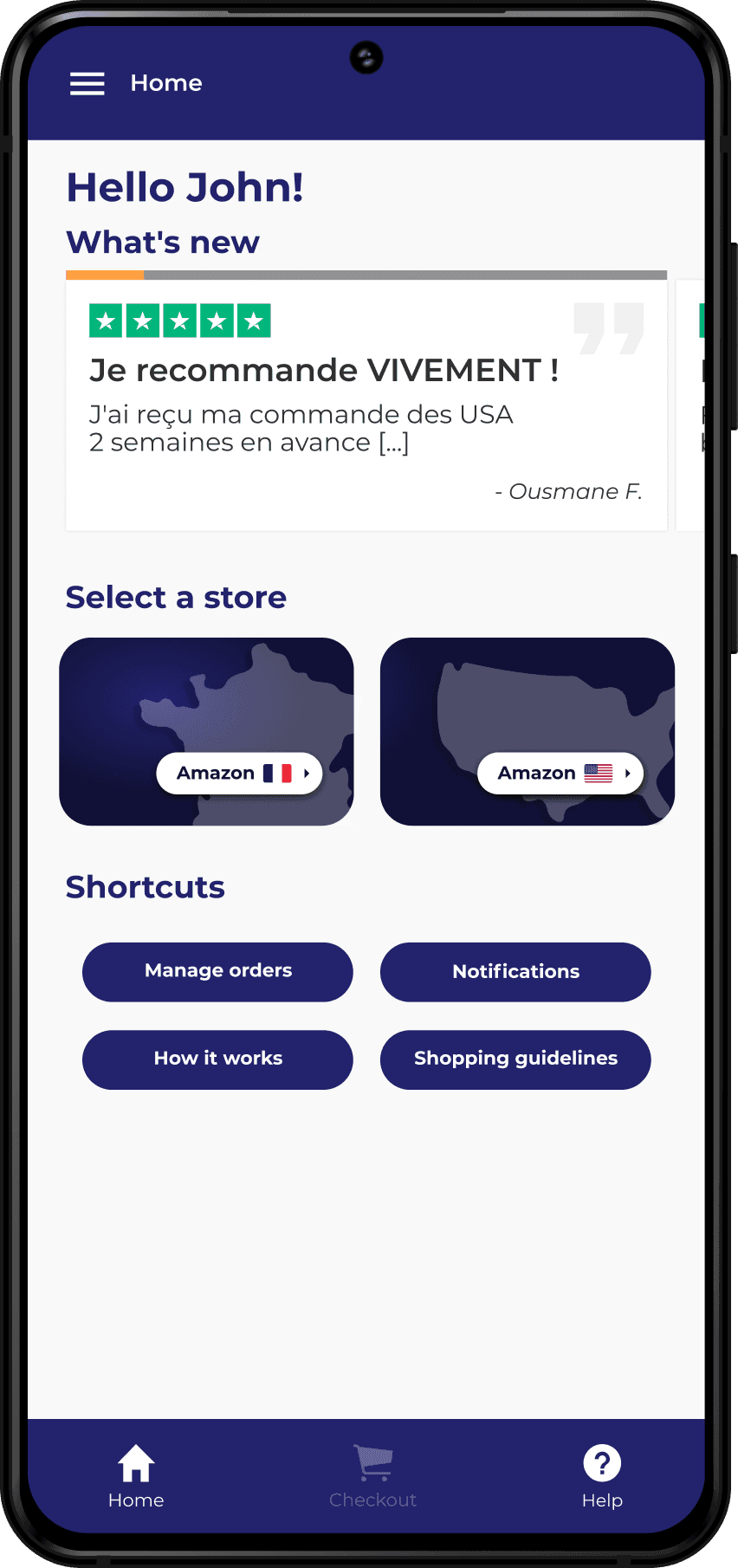
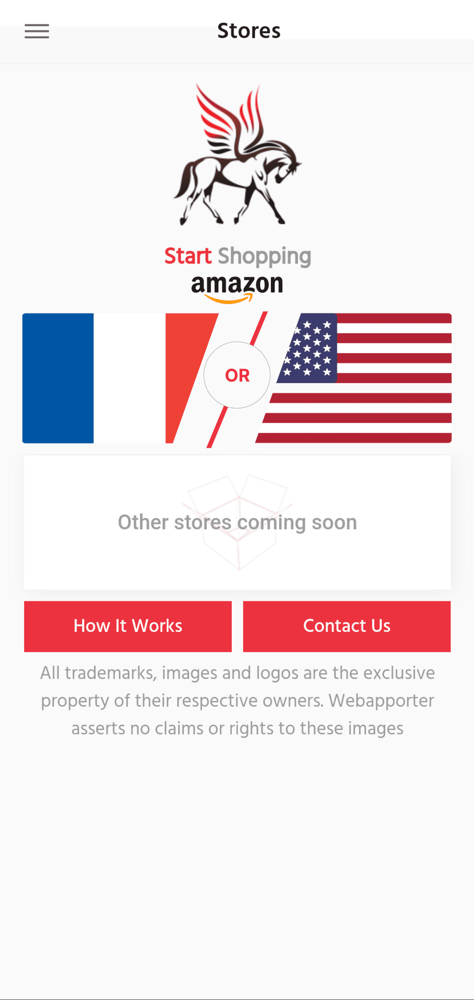
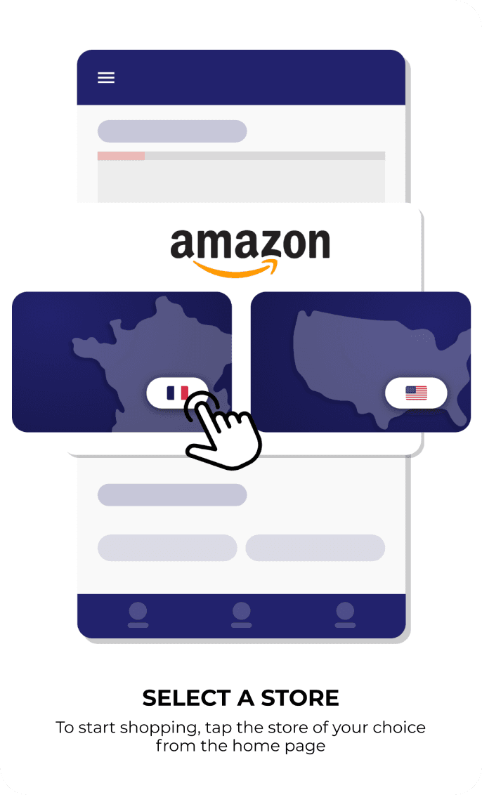
Redesigning the Home Screen

The home screen’s cryptic flag-based navigation baffled users, causing 68% to abandon the app early. By replacing abstract symbols with intuitive design, we transformed frustration into familiarity.

Original Experience

Cluttered layout and hidden CTAs eroded user confidence

Cluttered layout and hidden CTAs eroded user confidence

Extremely unclear and confusing navigation

Extremely unclear and confusing navigation

Complete absence of onboarding or guidance

Complete absence of onboarding or guidance

New Experience

Bold, labeled store buttons.

Replaced cryptic flags with familiar e-commerce patterns

Bold, labeled store buttons.

Replaced cryptic flags with familiar e-commerce patterns

Informative ‘What’s New’ carousel for updates.

Kept users informed about promotions and changes

Informative ‘What’s New’ carousel for updates.

Kept users informed about promotions and changes

Quick-access shortcuts to login and FAQs

Reduced friction for common actions

Quick-access shortcuts to login and FAQs

Reduced friction for common actions

Quick-access shortcuts to login and FAQs

Reduced friction for common actions

Streamlining the Checkout Flow

Hidden CTAs and unconventional steps confused users, causing cart abandonment. We anchored the process with familiar e-commerce patterns.

Original Experience

Ambiguous checkout path due to cut-off text and invisible button

Ambiguous checkout path due to cut-off text and invisible button

Unfamiliar and confusing checkout flow leading to cart abandonment

Unfamiliar and confusing checkout flow leading to cart abandonment

Complete absence of onboarding or guidance

Complete absence of onboarding or guidance

New Experience

Sticky checkout button, which remains persistent in navigation

Sticky checkout button, which remains persistent in navigation

Step-by-step overlay, guiding first time users through

Step-by-step overlay, guiding first time users through

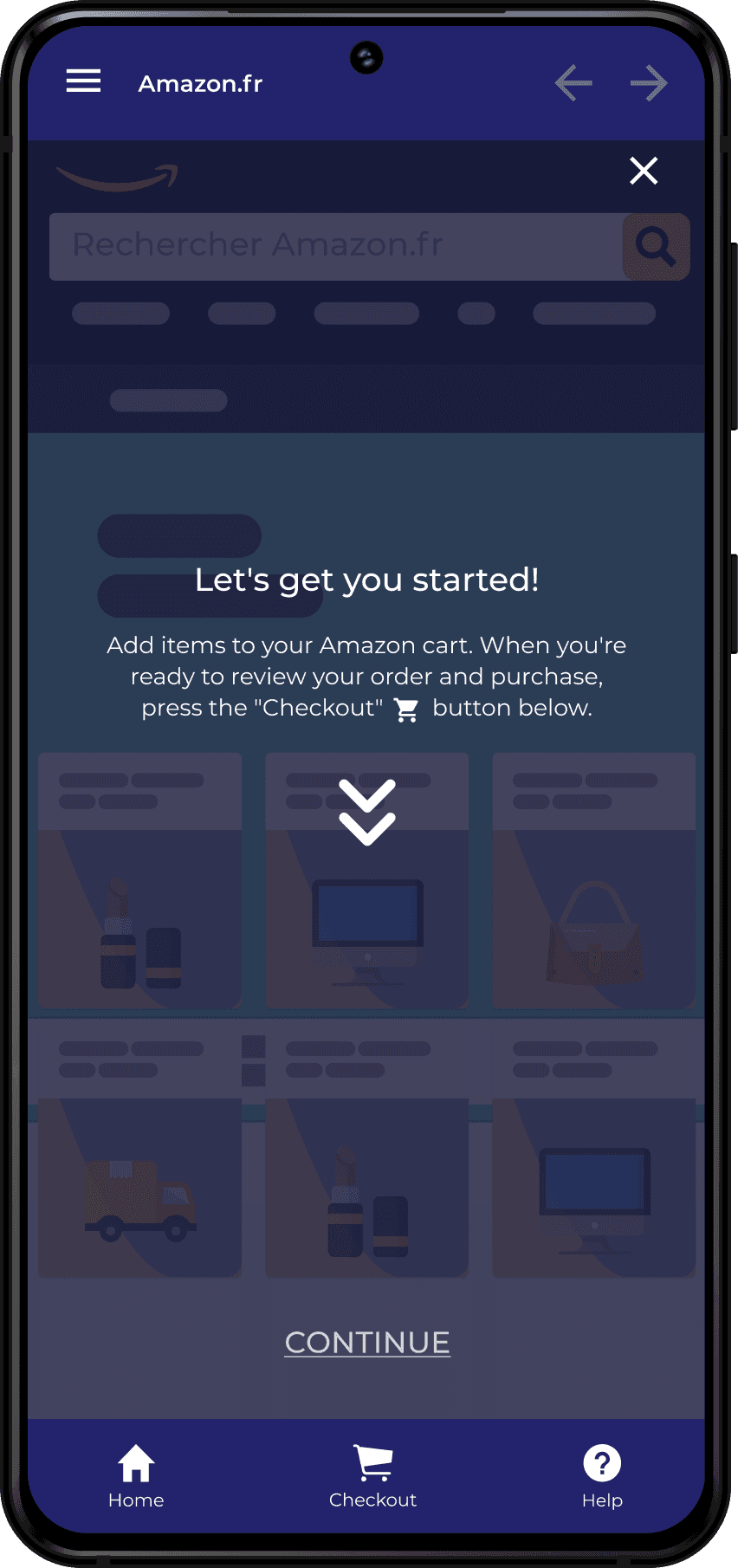
Introducing Guided Onboarding

New users faced a steep learning curve with zero guidance. We added interactive tutorials to turn confusion into confidence.

Interactive overlays, explained core features

Interactive overlays, explained core features

Always-visible help button, which remains persistent in navigation to provide instant support

Always-visible help button, which remains persistent in navigation to provide instant support

Takeaways

This project reinforced the importance of aligning design with user expectations while balancing technical constraints. Here’s what I’ll carry forward:

Feedback Fuels Iteration

Even informal user quotes and analytics revealed blind spots, driving smarter iterations.

Even informal user quotes and analytics revealed blind spots, driving smarter iterations.

Clarity Trumps Creativity

Labeled icons and bold hierarchies outperformed abstract symbols, proving that clarity is king in UX.

Labeled icons and bold hierarchies outperformed abstract symbols, proving that clarity is king in UX.

Onboarding is Non-Negotiable

Guiding first-time users with interactive overlays reduced confusion and empowered exploration.

Guiding first-time users with interactive overlays reduced confusion and empowered exploration.

Familiarity Over Novelty

Leveraging standard e-commerce patterns (e.g., sticky checkout buttons) built trust faster than reinventing the wheel.

Leveraging standard e-commerce patterns (e.g., sticky checkout buttons) built trust faster than reinventing the wheel.

© 2025 Ismaël Chabani

© 2025 Ismaël Chabani

© 2025 Ismaël Chabani